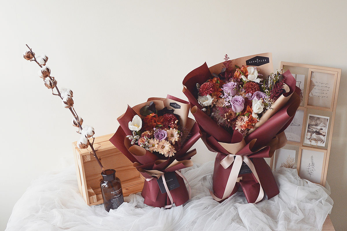
September Special Flower Design: Autumn Colors
September is the beginning of autumn season in the northern part of the world, including the northern part of Asia, America and Europe. As the weather turns colder, the traces of the vibrant summer colors leave the trees, flowers and the sky, leaving behind a more subtle color palette that colors the autumn season.
In July, our design uses vivid and bright colors for Summertime and in August, our design uses contrasting colors from the primary colors family of red, blue and yellow in Gemilang. For our September design, we decided to tone it down and use the Morandi color palette that are subdued and low key that fit well with the mood of autumn season.
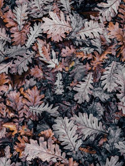
Photo credit: Annie Spratt
Giorgio Morandi and the Morandi Color Palette
The Morandi color palette is characterized by a muted color palette, subdued and desaturated with a grey tone overlay. The color scheme when applied to paintings, interior designs and fashion designs present a low-key luxury that has a cool and comfortable mood.
The Morandi color palette is named after an Italian painter Giorgio Morandi (20 July 1890 – 18 June 1964). Giorgio Morandi is well known as a still life painter and printmaker. A still life is a work of art depicting inanimate subject matters, typically commonplace objects such as flowers, landscape, vase, glasses etc. Printmaking is the process of creating artwork by printing, usually on paper. Giorgio Morandi paintings are characterized by their tonal subtlety in still life.
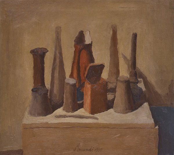
Natura Morta, Giorgio Morandi, painted in 1930
Giorgio Morandi is most well-known for paintings of bottles, vases and jugs on table. He worked in a limited tonal range, mostly in colors of grey, brown and white, the color tones which are now known as the Morandi color tones.
Morandi Tones: Desaturated Color Tones
The essence in Morandi tones are the desaturated color tones utilized in the color palette. But what exactly are desaturated tones?
Color saturation refers to the intensity of a color. At one end of spectrum, when the colors are fully saturated, the colors are considered to be in their purest form. The primary colors, red, blue and yellow are considered to be the purest form of colors. At the other end of the spectrum, when the colors are at the lowest saturation (desaturated), the colors appear to be washed out and pale. To achieve a desaturated tone, both white and black (grey) are added to a color to reduce the color’s saturation. This is why the Morandi tones have a grey tone overlay in the colors.

Adding white and black to achieve a desaturated tone
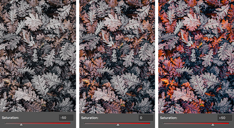
Adjusting the saturation level of colors
Decreasing the saturation level of colors can achieve a muted or calming effect, while increasing the saturation level of colors can achieve a vibrant and vivid mood. Thus, a desaturated color tones such as Morandi tones are a good choice to capture the calming and melancholy mood of autumn.
When East meets West: Morandi Tones in Traditional Chinese Settings
The drama series “Story of Yanxi Palace” took the world by storm in 2018. Besides the intense storyline that leaves the audience in awe, the drama’s architecture, costumes and accessories choices also captured the praises of the audience. The color tones used by the drama were the Morandi tones. It presents a subtle luxury to the palace settings and the character’s costumes.
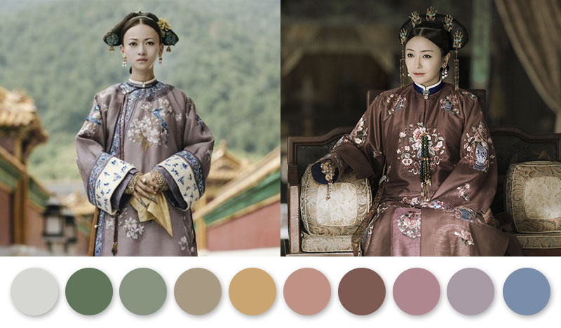
The Story of Yan Xi Palace (2018)
As September is also the month where we celebrate Mid-Autumn festival, we were inspired to incorporate some traditional Chinese palace elements in to the design, blending the western color elements to the eastern inspiration from the traditional Chinese palace.
Selecting Flowers
Morandi Tones with Hints of Traditional Chinese Palace Elements
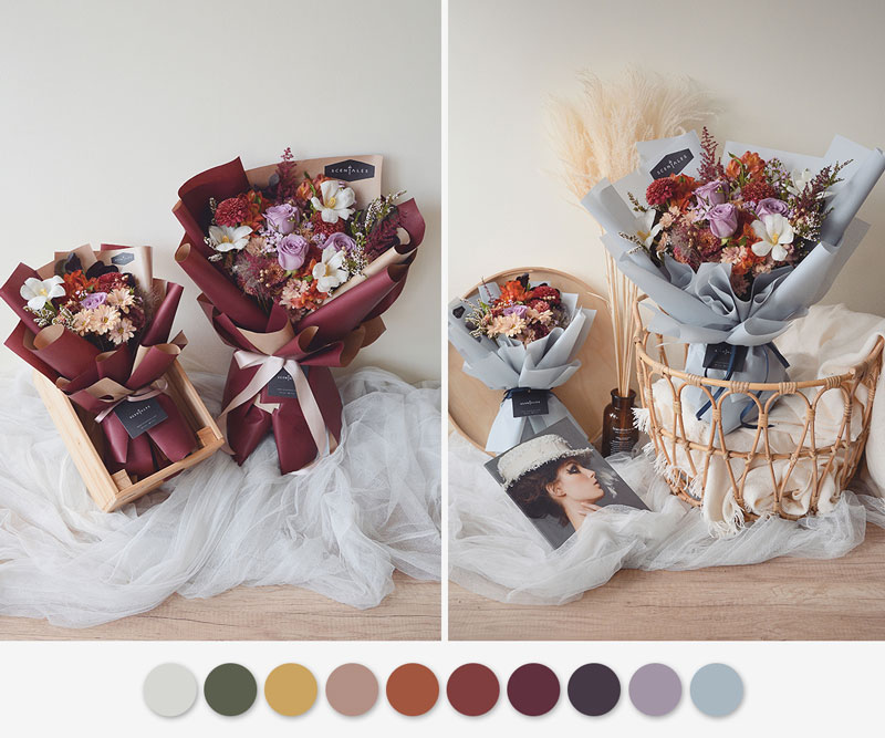
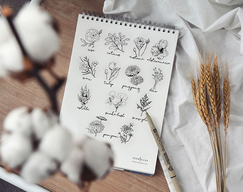
Morandi Tones Flowers
Olive
snow plum leaves, eustoma
Mustard
tulip’s pollen, alstroemeria
Champagne
pom pom
Marmalade
alstromeria, pom pom
Maroon
pom pom, ping pong, eustoma
Burgundy
pom pom, ping pong, astilbe
Eggplant Purple
cotinus leaves, smoke bush
Lilac Grey
ecuador tiara purple rose, dancing queen wax flower
Traditional Chinese Elements
Inspired by the traditional Chinese hair accessories, we added golden dried lino in the design. The dried lino are sprayed in gold to achieve this effect.
Gold
dried dino
When arranging the flowers, we utilize the different natural shapes and forms of the flowers to create a visually pleasing design.
The focal flowers of the design are Ecuador tiara purple rose, ping pong and white tulips which are in round form. The circular shape helps to guide the eye at first sight of the design before moving on to other elements of the design. Cotinus smoke bush are added in between these focal flowers. Cotinus smoke bush are in round foliage form. They allow the eyes to rest before moving on to other elements. We use various spray flower form such as dancing queen wax flower, champagne pom pom, maroon pom pom, tea eustoma, marmalade color alstroemeria, burgundy astilbe and dried lino. Spray flowers help to lighten and soften the overall arrangement. They add variation and interest and help to fill in areas that might otherwise remain open. Cotinus leaves which are in spray foliage flower form are added which serve the same effect as spray flower form. The spray foliage also helps to add bulk to the arrangement. Finally, white snow plum which are in line flower form are added to the arrangement. The natural form of a line flower can be straight or in curve. Depending on the curves of the flower, we add it to spaces in the arrangement to add depth and create breathing space to the design. Line flowers are especially useful in larger arrangements as they serve to guide the eye throughout the arrangement.
Finally, for the wrapper choices, we used two selections for the designs, one to give the design an eastern look, while the other gives the design a western feel. The maroon wrapper blends with the darker tones of the flowers to give an overall traditional and classy oriental mood to the design. On the other hand, the ash blue wrapper with a greyish overlay presents a vintage English vibe.
Autumn Colors Take Over Our Instagram
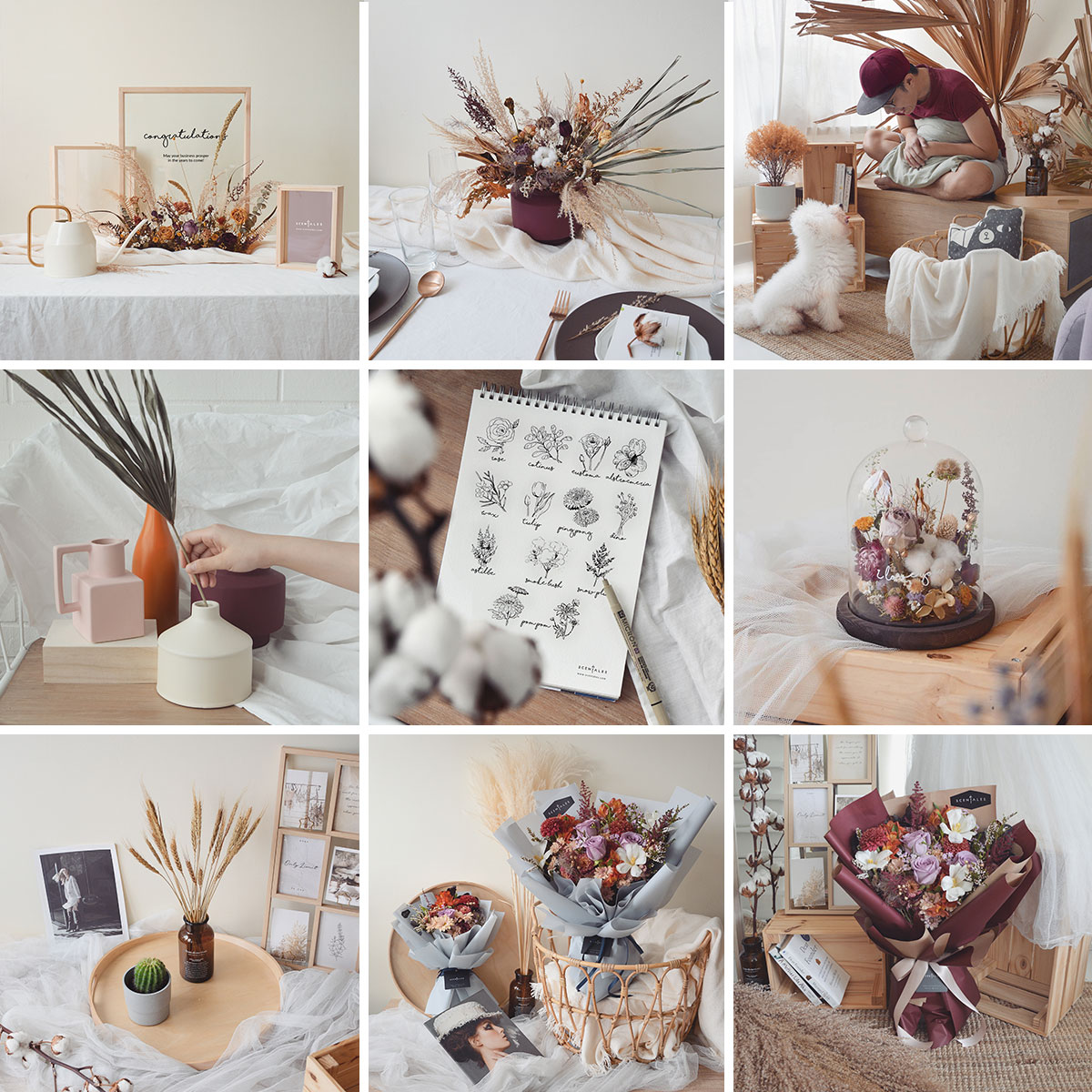
The beautiful colors of autumn painted our Instagram feed in September.
Autumn Season: Enjoy the Journey and the Little Things in Life

One of the songs that came to be synonymous with the month of September is the song ‘Wake me up when September Ends’ by Green Day.
Autumn does not have the vitality of Spring, the vibrant spirit of Summer or the resilience of Winter. It is the transition period when nature’s colors fade away and when the weather turns from lukewarm to cold. The season brings a certain somber and gloom that we are tempted to fall in a slumber as Green Day would and wait for the season to pass. But life is not all about the destination, it is about the journey as well. Autumn is the beautiful journey from Summer to Winter. Enjoy every little moments, every moment of change, be it happiness or sadness because we only get to live this life once.
Written by: Kyle
Co-written by: Clory
Photography by: Sharon.L
Flower recipe sketch by: Rachel

